ZETRA
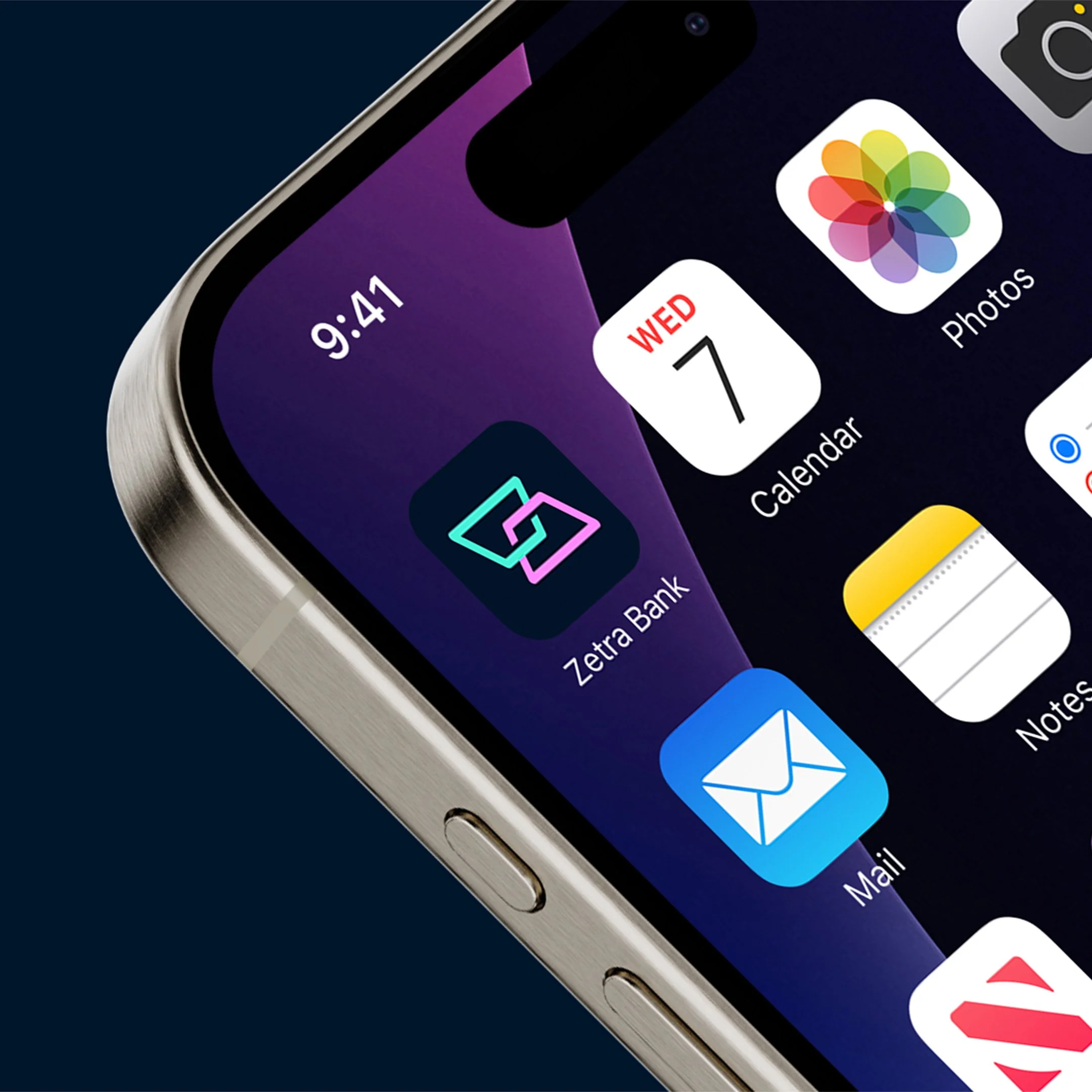
The icon for Zetra has multiple meanings. At first, you may see two blocks representing ingoings and outgoings, this is also communicated through the colours pink and green, If you look further, you may also see an abstract “Z”.
Considering their target market is a young demographic, the imagery used conveys trendiness and uniqueness. This is to take away the formality of online banking and offer a much more relaxed, modern approach, making Zetra seem more trustworthy and reliable to their customers.